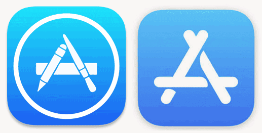
So…Apple just built the App Store from popsicle sticks. Or, I should say, rebuilt. First posted by @iClulture (via The Next Web), there are some new icons in iOS 11 Developer Beta 6, including this popsicle stand.

There are updated icons for Maps and the Clock apps, as well, as shown below.
De zesde beta van iOS 11 brengt nieuwe icoontjes voor de App Store-, Kaarten- en Klok-app https://t.co/vvHT64icmS pic.twitter.com/LVKQ1qxau6
— iCulture (@iCulture) August 14, 2017
Popsicle Sticks?
I’m not sure what message Apple wants to deliver with the new App Store icon, but I see popsicle sticks. And that doesn’t exactly say “quality” to me. The App Store is just that, though, quality.
The old icon hit on that thread of art and technology that is so important to Apple. It said that apps were created by artists. I get that message. I don’t get popsicle sticks.
Mind you, even if we all hate it, we’ll get used to it and deal with it. Apple seldom cares about kneejerk reactions like mine. I imagine that will be the case here, too. It’s also possible it will be changed before the final release of iOS 11.
I’d love to know what you folks think.
Wait to see the actual App Store, it’s as childish, and looklikes the yahoo site homepage: unprofessional, messy and chaotic.
It is obvious that the piece crossing over the lower piece is leaving a curved shadow, so yes they are tubes or at least the top of each is curved.
There’s also a new icon for Maps and both appear in the latest (whoever came up with this name was) High Sierra Public Beta.
I have to say that I like the new Maps icon … neat little Easter egg that it appears to show I-280 and the corner of the new Apple Park spaceship.
But I’ll agree that the new App Store icon is ugly … bigly … which means it probably was designed by Mr. Knighthood Has Gone To My Head himself.
Old UNIX Guy
Obviously it wasn’t designed by Ive or they would be pixel thin.
Hotdogs?
Cylindrical? “The interent is a series of tubes!”
Seriously though Brett, it certainly looks like they are cylinders.
If you look “more closelier” at the new App store logo, I think the curved shadows reveal that they are actually cylindrical, not flat. So they aren’t really tongue depressors or popsicle sticks.
Right?
I feel that it’s more Apple just simplify the logo to the bare elements. Popsicle sticks? Tongue depressors? Maybe an easel?
The map icon is the similar… more simple. The clock was already simple, but the slightly larger font make it easier on the these old eyes.
Good point BlackCorvid. Of course if you see enough popsicle sticks going into your mouth sooner or later you will be seeing tongue depressers.
As to the logo being artist’s tools. These days what percentage of users are creative types?
I see tongue depressors. Must be part of the new emphasis on health.
I see popsicle sticks also. I am equally mystified.