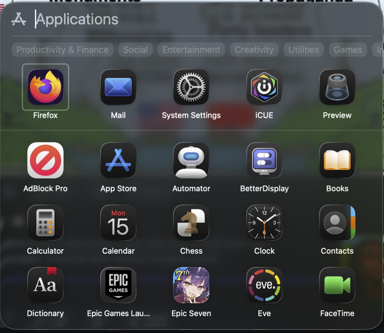
macOS 26 (“Tahoe”) swaps the old full-screen Launchpad for a new Apps panel tied more closely to Spotlight. On paper it’s cleaner and less intrusive; in practice, heavy Launchpad users say it’s a downgrade that slows them down. For broader context on why Tahoe’s UI is controversial, see our roundup: macOS 26 critics: cluttered & inconsistent.
What changed
The old grid you could organize into pages and folders is gone. The new Apps panel pops up as a floating window you can resize or move, shows categories under the search bar, and lists apps alphabetically.
Why people are upset
- It won’t remember size. You can resize the panel, but users report it snaps back next launch.
- No folders or custom layouts. Years of muscle memory—pages like “Work,” “Utilities,” “Creative”—are wiped out.
- Mixed, noisy app lists. iPhone apps, CrossOver/Parallels entries, and Adobe utilities clutter results; some say third-party apps don’t appear at all.
- Keyboard/mouse ergonomics feel worse. Horizontal tag chips don’t scroll with a mouse wheel; gestures feel glitchy for some; grid/list views are basic.
- Accessibility regressions. Folks who relied on big, spatially consistent icons say the new panel is harder to scan.
What still works (and quick coping tips)
- Recreate a fast launcher with the Dock. Drag /Applications into the Dock, set Display as: Folder and View content as: Grid for a one-click app grid.
- Lean on Spotlight (or a launcher). If you’re keyboard-first,
⌘+Space+ first letters is still the fastest way to open apps. - Trim the noise. Users report you can hide iPhone apps from appearing in results via Settings → Spotlight.
- Position sticks, size doesn’t. Moving the panel’s location is remembered between launches; resizing usually isn’t—plan your cursor travel accordingly.
- Third-party stand-ins exist. Utilities that recreate a Launchpad-style grid (with rows/columns and optional folders) can fill the gap until Apple iterates.
What Apple could fix fast
Remember the last size, add folders and custom ordering, improve mouse/gesture behavior, and ensure reliable indexing for non-App-Store software. Even without bringing back classic Launchpad, these would address most day-one complaints.
Bottom line
If you lived in Launchpad, Tahoe’s Apps panel feels like a step backward—less organization, more friction. If you already launch via Dock or Spotlight, you’ll adapt quickly. Power users want Apple to keep the lighter look but restore the old control: persistent sizing, folders, and true customization.


I moved to GNOME (Linux), which allows you to organize your apps like Launchpad used to. Linux a little wonkier, but it’s just as pretty and a whole lot faster, even moving from Silicon back to Intel. Whoever the genius was who decided to make Macs even stupider than iOS (where you can still organize your own apps into groups) should sent to work in the Trump administration, where stupidity and regression is a matter of policy.
It’s time for Tim Apple to retire-the sooner the better
“Stupity and regression is a matter of policy”…
Yet you regressed back to Intel and Linux.
Yep. Probably killing you that it’s the right side of your brain that liked Launchpad.
In just a few more generations of macOS the mac and ipad will look identical.
This is jjst annoying.
Just tossing another complaint on the pile. I wanted to open an app and couldn’t remember the name. Normally it’s in Launchpad > Dev Tools. Now I have to wrack my brain to remember the name and find it. I had my whole workflow organized and Apple just ripped it away from me without even asking. I filed a feedback/suggestion and I think everyone else should do the same so Apple knows how many upset users there are. Maybe they’ll put it back!
How I wish I’d read reviews before updating. From custom organized folders to a pile of apps that I get to sort through like dirty laundry. It looks like Apple is using the collected information from those who don’t turn it off because that’s how you get junk like this – computers for people who don’t know how to use computers.
ouch. yeah, but take solace, that’s what I’m here doing. I’m not touching that update until they tone down the glass and fix launchpad, at least. Completely boggles my mind that they’d trash things people put effort into sorting into an order, naming folders, etc.
Like? This is some pretty fundamental violation of UI foundations.
Removing or undoing customizations breaks the user’s sense of control and trust. Don’t break the user’s mental model. Basically, don’t destroy user work/Preserve user effort. Systems must not delete or override the work users have invested.
People dragged those apps into the order they wanted. They arranged folders and named them. Deleting that is absolutely a violation of user data. It’s literally deleting your stuff.
Did they break anything else that I need to look out for them fixing before I ever update?
Go learn from it and turn OFF automatic downloads and updates now. It even lets you keep it on for security responses. I’ve done this for many years now because apple constantly messes things up and then _maybe_ fixes them if enough complain.
Oh yeah, go submit to the apple feedback. I did.
Some of my installed apps don’t appear in the new app launcher. They do appear in the Finder’s app view. This issue makes the new app launcher useless in my opinion. Some users state you can simply type in a search, however what if you can’t remember the app’s name, how would you start your search? The whole idea of having an “App Launcher” is to be provided with a COMPLETE list of all your installed apps.
As a Windows convert, I’m loving the new Apps feature. It’s fixed feature set prevents users from messing up the list, which is something my kids would do.
I’ve been a Windows user my whole life. From 3.11 up to Windows 11. I picked up an old 2018 Mac mini just because of the form factor for a living room pc for the family – entirely expecting to only use boot camp and windows on it. I ended up dabbling with sequoia quite a bit and really enjoyed the integration with our iPhones and Apple TVs. I ended up learning a ton about macOS and the wife and son just picked it up like it was second nature. I also, unexpectedly, ended up enjoying macOS so much that we now have 2 Mac minis, two MacBook Air m1s, and I recently purchased a MacBook Pro M4 pro for myself. My 14900k 4080super pc just sits in my office turned off nearly every day – I only use it for VR gaming now. I’ve been actually gaming quite a bit on my new MBP, right now playing through the RE games. I told my wife macOS reminds me of Windows 7 was – just a damn fine operating system that didn’t try to be anything but an operating system. It didn’t annoy me with a bunch of bs I didn’t ask for, it didn’t spy on me and it didnt regularly spike to 30% of my resources when I’m not even running any applications. I updated my MBP to Tahoe today and I have to say – I’m past frustrated with the new app launcher BS. For me, the biggest frustration is that now I can no longer simply right-click on the launcher and get a list of all my apps. That was how I launched the majority of my apps. I know I can add them to the dock and I have added my most used apps to the dock but this seems like an enormous step backwards. The kind of step backwards that Microsoft has a track record of doing. I genuinely hope that Apple doesn’t continue to step on rakes like this. For now, I’ve committed to wiping and re-installing sequoia for now – all over this launcher shit-show.
how’d the re-sequoia-ing go?
In terms of accessing groups of commonly-used apps, the Mac Desktop is now more stupid than an iPhone or an iPad, where you can still organize your apps as you like.
Exactly! At least it doesn’t impact me as much since my iPas is my primary computer, but man am I shocked at just how terrible of a design this new Apps page is for macOS 26. It feels like such a waste. I would have preferred it if they would have added the App Library instead, and it would have also created more unification as well.
screw that – the App Library is another own goal, random “organisation” system that decides for us what we need to see… come on. Its my computer that I set up in a way that helps me get to what I need to get to… The App Library is terrible, and this is even worse
The folding of Launchpad into Spotlight with no ability to adjust the categories is PAINFUL. Apple glibly suggests you just start typing and what you’re looking for will appear. What if you need an app but don’t remember its name? Under Launchpad you could arrange your apps in groups so you could find an app in the context of other apps.STEP BACKWARD.
The folding of Launchpad into Spotlight with no ability to adjust the categories is PAINFUL. Apple glibly suggests you just start typing and what you’re looking for will appear. What if you need an app but don’t remember its name? Under Launchpad you could arrange your apps in groups so you could find an app in the context of other apps.STEP BACKWARD.
Agree completed. I HATE the giant, messy jumble called ‘apps’. I can’t find anything. It’s wasting my time, and I feel like throwing the computer out the window.
Why won’t Apple just let us choose how we set up our computers. I had a lot of apps all neatly sorted into folders on one screen. I could find everything quickly. Now I just see a mass of confusing apps in random order. I can’t access them quickly, and (thanks to an injury) my memory doesn’t remember app names. Instead, I see a sea of clutter. It’s horrendous!!
It’s amazing how many users never used Launchpad, and seem surprised at the backlash from those that did. I used Launchpad like an extension of the Dock, but now I guess I’ll be using Finder instead (like we did in Snow Leopard).
If I’d known how awful the Mac OS would become I would have never bought Mac book pro last year. The removal of Launchpad, which trashed my workflow is a travesty.
There is nothing more frustrating than stopping mid-task to start fumbling around looking for the application that used to be pinch and click away every time you needed it. The App panel can’t even find applications that you type into the search bar… even though they are clearly listed in the alphabetical list once you change to that view and scroll. If you are looking for Word or Excel, you have to remember that it will be alphabetized by Microsoft. The categories are awful – I need them to be things like Phase A Workflow and Coaching and Graphics. Wasting my time and telling me how to do my job… Just start making boring beige boxes, Apple. Think different, my butt.
“Wasting my time and telling me how to do my job”
Yes! I agree wholeheartedly. Why Apple would break something that made its computers so easy to use? Why not just let users choose how to access apps instead of dictating to us how to do our work?
The new Apps feature is such a backwards step. No ability to omit the increasing number of Apple features I never use, no ability to order the programs so the unused ones permanently reside at the bottom. Apple used to be so customer-focused – what happened.
Until something changes I’m using AppHub as an add-on. Not perfect but it gives me some form of Launchpad back.
Cosmetic changes may eventually be coped with (not ideal).
After a brief trial in Eclectic’s Viable virtual app, I will be actively resisting Tahoe. Deal breaker was the awful replacement of Launchpad with Apps menu.
Apple’s arrogance rivals my least favourite OS. The Software update process from 15.6.1 to 15.7 was duplicitous. You had to drill into the Sequoia Update now, uncheck Tahoe 26 and manually select 15.6. Tricky/Trickery?
Perhaps the only way forward is to run Sequoia in a VM and pretend it not happening
Did apple let Microsoft into the dev team?
Or maybe Google?
The replacement of Launchpad with “Apps” (what idiotic a name) was probably created by hallucinating Siri AI (or Tim’s own hallucinations). In any case this should GO!
I agree. It stinks that the Launchpad pages are gone.
I rolled back to 15.7 because 26 is so bad.
I loved the launchpad, I don’t want to have to open a freaking finder window to use my apps! You can’t even customize where the apps go on this new “apps” menu.
Apple is trash
Tahoe could honestly be one of the worst MacOs upgrades ever.
Apple making choices for users rather than having user choice – hate the look and feel of macOS and the usability has taken a back seat, adding extra steps to accomplish the same old tasks. Windows becoming more usable and macOS less so is laughable
Why does it show iPhone apps that can’t even be used from the Mac. You cannot open the camera app. MacOS will not let you use your iPhone camera remotely for obvious reasons, but why is it unremovable and listed? Any app that uses faceID is useless.
I am absolutely fuming about the removal of launchpad. It has ruined my macOS experience. The new launcher thing is bad for the reasons outlined, great if Apple could improve that, but why not also have launchpad as an option?! It was so handy and basically my Home Screen on a Mac. It saved me from having to have loads of distracting things in the dock – keeping that for just what was active. For me it’s the equivalent of them adding App Library on iOS but then simultaneously removing the ability to put apps where you want on the Home Screen!! Apple’s app categorisation is inconsistent and changing. I don’t want to remember app names or resort to keyboard. They had built this beautiful interface that worked great with flicks gestures and clicks and could be customised to the person. I could easily see all my apps arranged logically for me, with their notification badges (not visible in the workaround apps folder in the dock). I’m not against them introducing the new spotlight launcher, but the outright removal of launchpad is the worst decision Apple has ever made, for those of us who used it.
You said exactly what I’m thinking.
Recovering from an illness, I’ve had memory issues, brain fog, and get easily distracted. Launchpad was perfect as everything was perfectly organised in a way that was intuitive to me, and it helped me keep working despite the disability.
By removing Launchpad, Apple has deleted an interface that I was using as an accessibility support. They’ve replaced it with something that is cognitively noisy, visually cluttered, and actively hostile to low-effort visual searching. For someone in my circumstances, this is a productivity disaster.
Aw, F*ck, I won’t update now.
yep me neither, but Im glad I heard about it before. funnily enough I was just tweaking my launchpad layout when I heard about this.
you can still submit feedback. apple (should) care about if people dislike something so much they wont update. I just straight up said I will not be updating until this is resolved, and that’s the truth.