Apple has redesigned its first-party app icons again in iOS 27, and this time the focus is on fixing the blurry Liquid Glass look that many users complained about in iOS 26. The new icons keep the glass-style design, but Apple has added more layers directly inside the artwork to make icons look sharper, clearer, and easier to read.
iOS 27 Makes Liquid Glass Icons Clearer

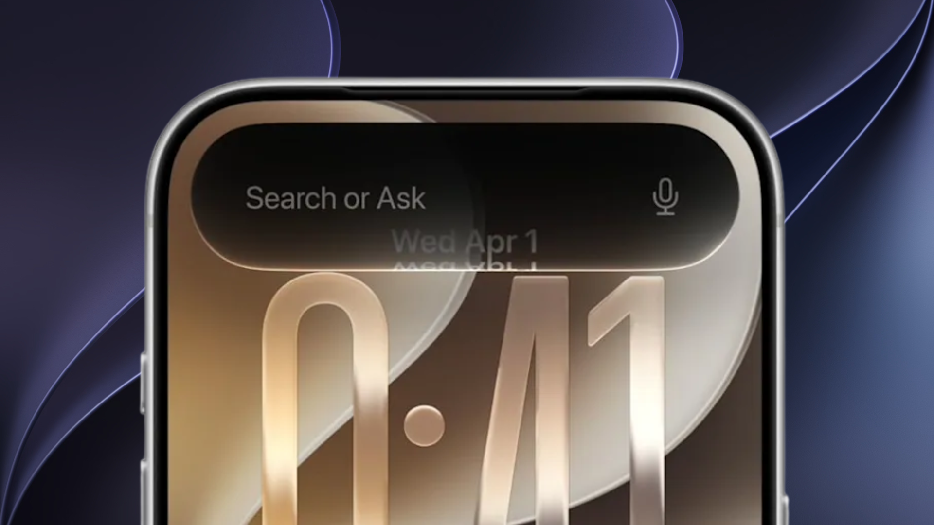
With iOS 26, Apple gave all first-party app icons a heavy glass effect with reflections, depth, and a shiny finish. However, some icons looked washed out because the glass layer sat too strongly over the actual artwork.
In iOS 27, Apple has changed how these icons are built. The new design uses multiple Liquid Glass layers inside each icon, which gives the artwork more separation and better definition. As a result, icons now show more detail, stronger contrast, and cleaner edges.
Apple has also adjusted the reflection effects so they appear only where they help the design. This makes the Liquid Glass finish feel more controlled instead of overpowering the icon artwork.
Apple Removes the Tilting Icon Effect
Apple has also reworked the motion-based shimmer effect from iOS 26. In the first iOS 27 developer beta, icons no longer shift highlights when users tilt the iPhone, which removes the visual effect that made some icons appear slanted.
The updated icons still have subtle highlights at the top and bottom, but they look calmer and more stable on the Home Screen.
Apple has also updated Icon Composer so developers can build app icons with multiple Liquid Glass layers and preview how they will appear in iOS 27.