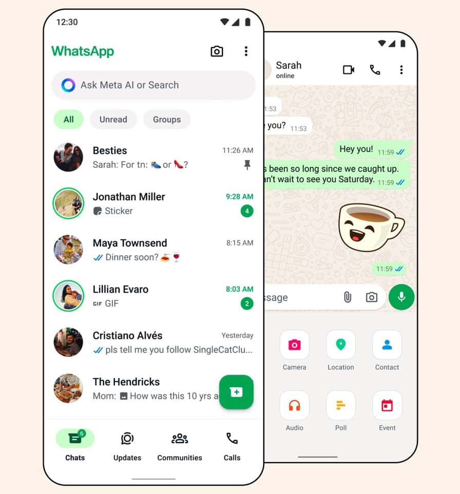
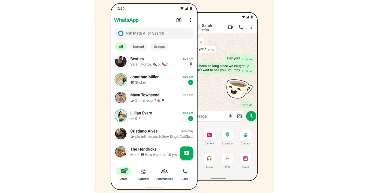
WhatsApp has revamped its design on both iOS and Android. The latest update arrives with one of the most significant UI change in the recent past. The fixed green bar on the top is now gone. Instead you get to see an all white background, which in my opinion is neat and minimalistic. Other changes span across floating text buttons, icons, and the colour of the read message receipt.

With the green tab gone, WhatsApp’s dark mode is now darker. This is expected to increase the visibility of text in both light and dark modes. WhatsApp has played around with the colour scheme. They say the color overhaul is intended to help users focus on the “things that matter the most.” Furthermore, the spacing between icons, text, and other major elements is increased for increased legibility.
I have noticed that WhatsApp has worked on the search feature. Despite thousands of messages, the indexing is significantly faster. The search bar is now fixed at the top of the chats tab. There is no more swiping down to access it.
In the past WhatsApp has used a darker shade of green for icon. WhatsApp has toned down the green which is used for notifications, text, badges, and icons. You also get to see new icons. WhatsApp has also added a redesigned attachment tray that is faster than before. Meta is rolling out the update in a staggered manner. It could take some time before the update is rolled out to everyone. Did you like WhatsApp’s new update? Let us know in the comments below.
