
For years, iPhone users have praised Apple’s design for its comfort and reach. Everything important sat within thumb’s distance, even on larger screens. But as iPhones grew taller and Apple introduced the new Liquid Glass design language in iOS 26, that once-careful balance feels off. A growing number of users now say Apple’s interface no longer fits the way people actually hold their phones.
A Reddit thread questioning the “New Event” button in Apple’s Calendar app captured that frustration. The original poster asked why the button still sits at the top of the screen when it’s used more often than the Inbox. The post quickly spiraled into a broader debate about one-handed use, reachability, and Apple’s inconsistent design decisions.
Buttons moving out of reach
Many users agreed that the problem goes beyond Calendar. In iOS 26, several core apps moved key actions to the top half of the screen, while others kept them on the bottom. The inconsistency feels jarring on today’s larger phones. As one commenter put it, “The obsession with putting buttons at the top when phones are getting taller will never make sense.”
Some pointed out that Apple itself once recognized this issue. Notes, Reminders, and even Safari put core actions at thumb level. Now, with the new Liquid Glass design, some apps ignore those same usability lessons. For people using Pro Max-sized iPhones, that top corner feels further away than ever.
Defenders of the design
Not everyone is bothered. A portion of users said the current setup works fine, arguing that Calendar hasn’t changed in years and shouldn’t fix what isn’t broken. They reasoned that creating events usually involves typing, which requires two hands anyway, so a top-placed button doesn’t add much friction. Others noted that reachability depends on how someone holds their device; there’s no single layout that suits everyone.
The real issue: inconsistency
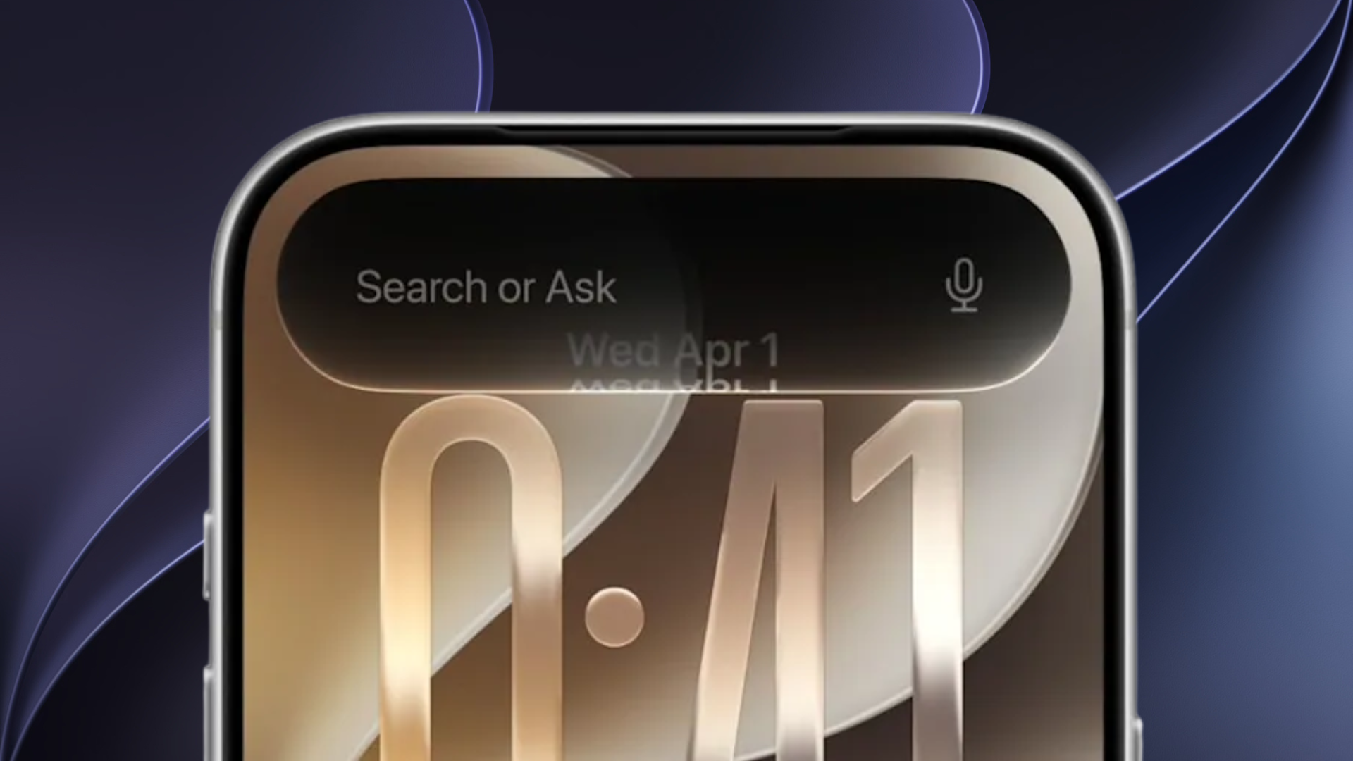
The deeper frustration isn’t about one button. It’s about inconsistency. In iOS 26, Apple’s new Liquid Glass aesthetic was meant to make navigation clearer, yet it’s done the opposite for some. Search appears at the bottom in certain apps, floats on the side in others, and stays at the top elsewhere. Users say it feels like Apple “slapped glass over old layouts” instead of fully rethinking them.
For a company known for precision, this scattershot approach to interface design feels out of character. The complaints piling up on Reddit and Apple’s own feedback portal suggest that even small layout choices can erode trust in the design language as a whole.
The one-handed era might not be dead yet but iOS 26 is testing how much reach users are willing to lose before they push back harder.


After reading this article I’ve skimmed through the documentation and finally learned how to activate the one-handed mode on iPhone, that is, the feature where the current app reduces itself to occupying the bottom half of the screen, this way making easier to reach every control with the thumb.
It’s unrelated to the article but it makes me happy. I used to activate it unwittingly, now I know that you need to quickly swipe down the bottom edge of the screen. Of course it must be enabled in a setting in Accessibility (which usually is).
Regarding the subject of the article, I don’t have a strong opinion: I think that phones have become too big to be controlled with one hand only, so I guess this is a price to pay.
Apple. Reduce the ‘friction.’