
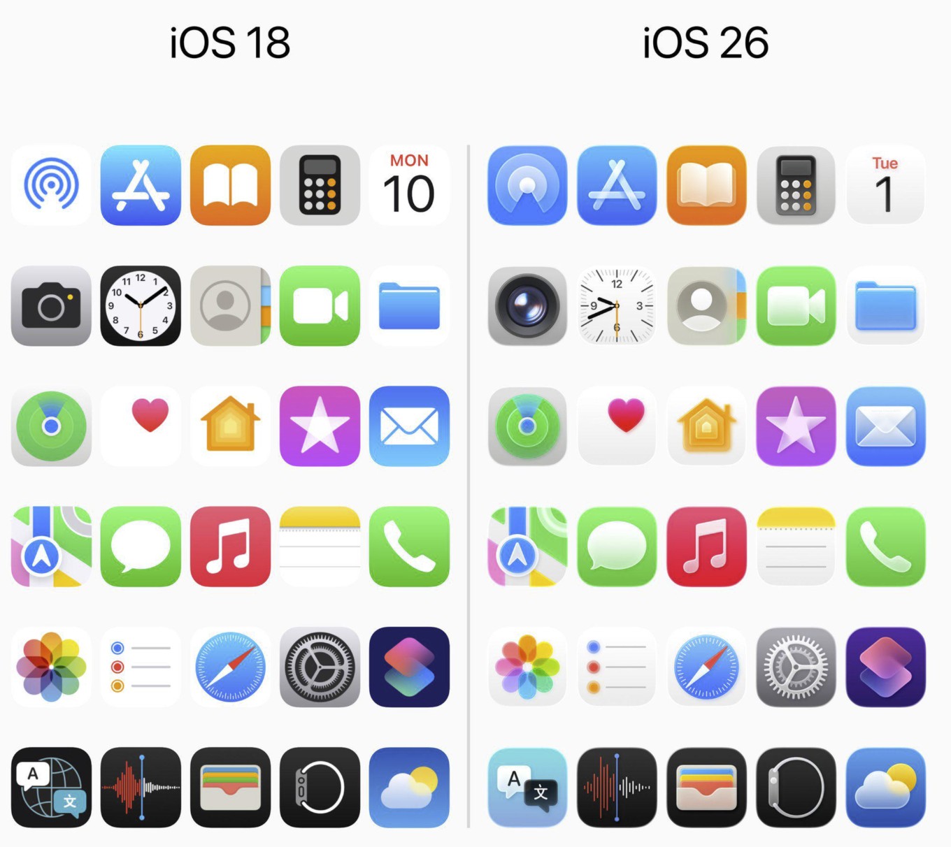
The thread is split. Fans see a thoughtful refresh that nods to classic iOS and matches the new Liquid Glass look; critics say the icons feel blurry, low-contrast, and less legible—especially Camera and Clock. A lot of people also say they’ll get used to it in a month.
What people like
- Homage + cohesion. Some applaud the Camera icon’s return to a lens motif, reading it as a callback to early iOS and a better fit for the glassy aesthetic. Designers in the thread describe “more fidelity” that aligns with macOS styling and the broader Liquid Glass language (see how the sheen works in Liquid Glass explained).
- It actually feels modern. A chunk of commenters prefer the refreshed depth over years of flatness, calling it a needed shake-up.
What people dislike
- “Blurry” vibes and reduced contrast. Many say the icons look soft and harder to parse at a glance—Mail, Settings, and especially Clock get called out for readability. If motion and bloom add to eye strain, you can tone them down using our tweaks in How to make iOS 26 less animated.
- Camera backlash. The lens art splits the crowd: fans call it nostalgic; detractors say it clashes with the flatter set and is less instantly recognizable.
- Inconsistencies. Several noticed the Lock Screen/Control Center Camera icon still looks like the old glyph, which breaks visual continuity.
- “Why spend time on icons?” A recurring sentiment: prioritize functional improvements over cosmetic churn. If you’re still deciding whether to update, we weigh stability in Is iOS 26 stable? We answer.
The “it’s not that different” camp
Plenty argue most icons are nearly the same—and that complaints follow every visual rev. That normalization effect came up a lot: after a few weeks, you stop noticing.
Design takeaways
- Readability vs. realism is the real debate. Liquid Glass introduces depth and reflections; some read that as premium, others as noise. If you want the look with fewer distractions, start with the customization tips in Liquid Glass explained.
- Expect iteration. Apple often nips and tucks visuals in point releases; small contrast and glyph adjustments wouldn’t be surprising (watch our update hub from iOS 26 features to try for changes).
Bottom line: The community’s loudest friction points are contrast/clarity and the Camera/Clock icons. If the glassy sheen delights you, the set lands; if you prize instant recognition, consider dialing down animations and bloom, and give your eyes a week to adjust.
Don’t miss the best of The Mac Observer
Set us as a preferred source and our Apple reporting ranks higher in your Google Search results and Discover feed — one tap, no account changes.



Discussion