

- iPadOS 26 has removed core multitasking features like Slide Over and the bottom app-switching bar.
- Users report that simple, one-swipe actions have been replaced with complex, multi-tap processes.
- The update is being criticized as a failed attempt to make the iPad more like a MacBook.
- Some long-time power users are so frustrated they are considering selling their iPads.
The recent release of iPadOS 26 has sparked a significant backlash among some of the iPad’s most dedicated users, many of whom claim the update has completely wrecked the multitasking experience. The core of the frustration stems from Apple’s decision to remove several long-standing, intuitive features in favor of a new, more complex windowing system that users are calling a major step backward.
The most lamented removal is Slide Over, the feature that allowed users to quickly pull up a second app in a floating window for quick interactions without leaving their primary workspace. What was once a single swipe now requires a cumbersome, multi-step process: users must return to the home screen, manually find and open the app, resize it into a floating window, and then manually minimize it again after use, breaking their workflow in the process.
Another major pain point is the removal of the horizontal bar at the bottom of the screen, which was the primary way to quickly swipe between different full-screen apps and Split View combinations. This fluid, muscle-memory gesture has been replaced by a system that forces users to pull up the app drawer or Exposé view and manually select the correct app arrangement, adding friction to a previously seamless action.
Don’t miss the best of The Mac Observer
Set us as a preferred source and our Apple reporting ranks higher in your Google Search results and Discover feed — one tap, no account changes.
These changes are compounded by the loss of the versatile three-dot menu at the top of app windows, which provided instant access to manage different app instances and views. Like the other removed features, its functionality has been buried within other menus, turning simple one-tap actions into a more cluttered and less efficient experience for users.
According to those affected, the problem is not the addition of new tiling features, but the forced removal of a proven and beloved system without giving users a choice. The push to make the iPad function more like a Mac has, in the eyes of many, stripped away the touch-first simplicity that made the device unique and powerful in its own right.
The sentiment among this vocal group is that Apple should have enhanced its newer Stage Manager system while keeping the traditional Split View and Slide Over intact. Instead, the current implementation feels broken to many. With workflows built over years now completely dismantled, some long-time fans are so disappointed with the new direction that they are seriously considering abandoning the iPad platform altogether.


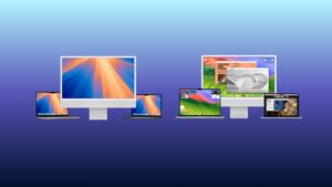
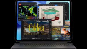
My iPad has become frustrating for me to use and remains frustrating a year later.
Worst ux ever
Glass simulates glare
Reduces legibility – increased eye strain
Far from admitting they f’d up,
They won’t fully provide an unembelished theme,
Leaving a hint of stupid highlights shadows there for people who clearly do not want them.
And if the visual bs wasn’t enough, they broke functionality
Try dragging dropping your grouped icons – to rearrange semantic context of desktop saved research bookmarks.
Totally borked now.
Sick of the we know best attitude
What is the point of investing in accessibility if you let some bunch of tosses undermine the fundamentals of the interface.
It just plain sucks, there is no other description…this is why I have both MacBooks and iPad on trips. A computer is what a computer is and so is iPad. This new dangled bs sucks to high heaven. Take not Apple geeks, we will leave Apple over this alone.
It’s frustrating that something which used to take a single finger now requires a year of effort and four fingers to accomplish. At this rate, I wouldn’t be surprised if next year it takes a head bump to trigger a command.