
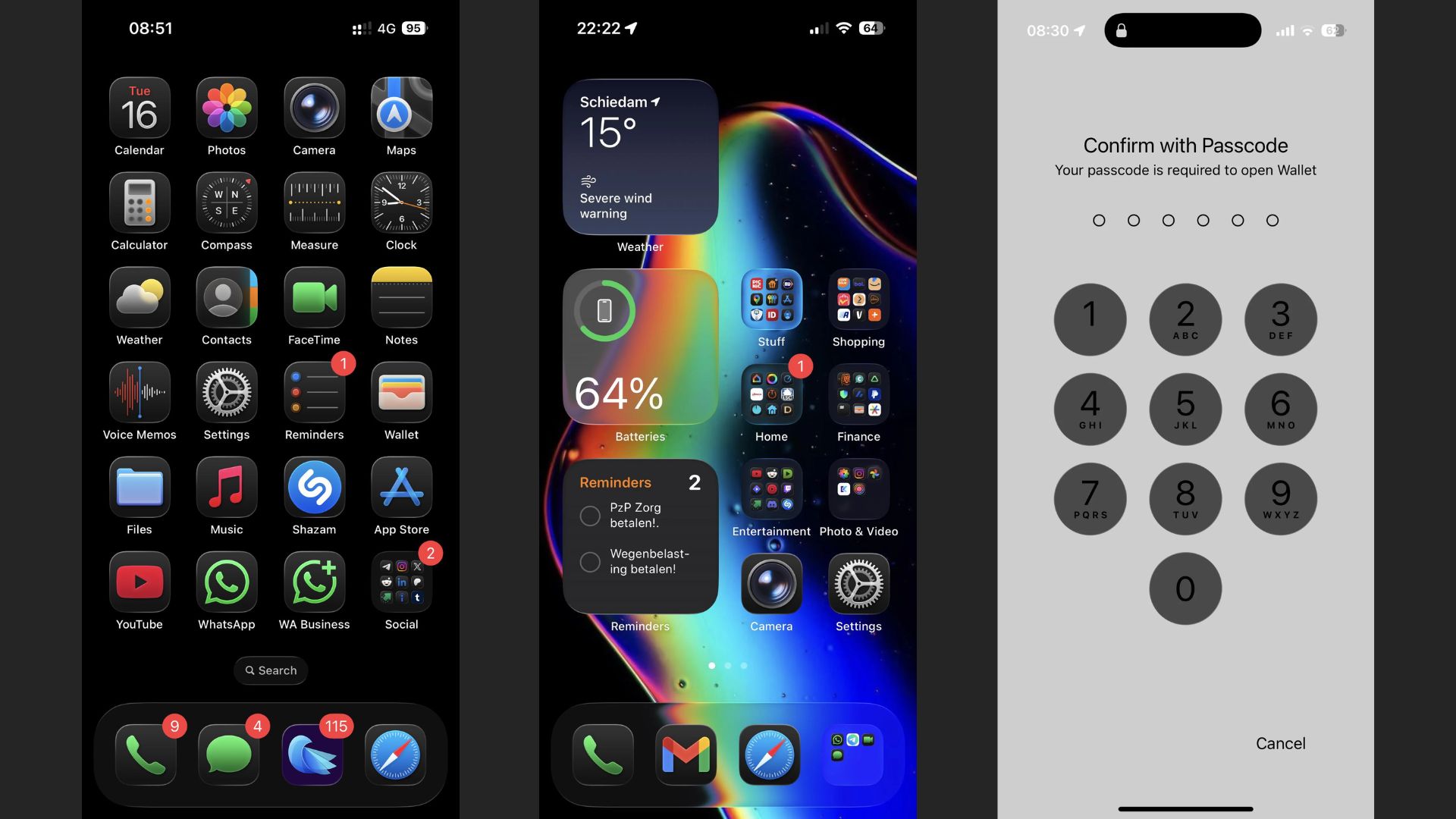
We all know Apple’s iOS 26 introduces a new design called Liquid Glass. It applies glossy, semi-transparent effects across the interface. On light wallpapers, the look is very subtle. On dark wallpapers, it’s looks overwhelming and not optimal as light wallpapers.
Some users say the reflections make icons cartoonish, borders too bright, and text is harder to read which disrupts the whole idea of this new design change. Still, the feature has quickly become one of the most polarizing parts of the update.

Here’s the thing. With dark icons on a dark background, the shine dominates. Instead of highlighting your apps, the effect pulls focus away from them which is really bad. We can compare it to outdated Android themes from a decade ago. While some enjoy the sense of depth and motion, many want the option to tone down and adjustable or disable the effect entirely.
Don’t miss the best of The Mac Observer
Set us as a preferred source and our Apple reporting ranks higher in your Google Search results and Discover feed — one tap, no account changes.
Apple has not given you a toggle to turn the whole Liquid Glass off. Well, OfCourse the design was even stronger in early builds as noted by Beta testers, which suggests Apple has already toned it down once. But the current version still has complaints, especially from people who prefer dark mode. The inconsistency is also noticeable in Apple’s own widgets, which sometimes appear flatter or glossier depending on the screen or wallpaper.
What you can do now
You can’t disable Liquid Glass, but you can reduce its impact. Accessibility settings provide workarounds:
- Turn on Reduce Transparency in Settings > Accessibility > Display & Text Size.
- Try Increase Contrast to make text stand out against the background.
- Swap to a lighter wallpaper if readability becomes an issue.
- Submit feedback directly through Apple’s feedback page to push for changes.
Typically, Apple ignores appearance-related feedback because it’s subjective. But strong public response has already motivated Apple to make changes during the beta cycle. If you don’t like the dark mode, maybe try posting complaints on social media. These complaints combined with formal feedback, increases the odds of changes in future updates.
A portion of users appreciates the “new and fresh” look, seeing it as a shift away from years of flat design. Another group calls it distracting, gimmicky, and less professional. Until Apple offers more control, you’ll need to decide whether to adapt, tweak your settings, or make your voice heard through feedback.


Discussion