Apple is changing how you find apps on its smartwatch. For years, users only had two layout choices for finding apps, but that changes this fall. The upcoming watchOS 27 update introduces a completely different way to interact with your wearable device. Instead of digging through endless rows or a giant honeycomb, the software now prioritizes the apps you actually use right when you press the button on your Apple Watch.
Pressing the digital crown now opens a dynamic app grid
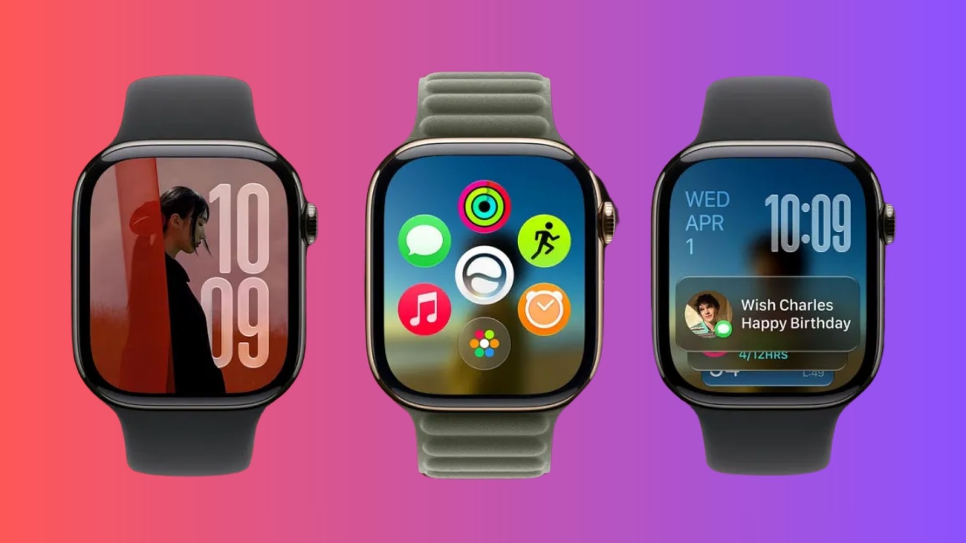
When you press the Digital Crown on the new watchOS version, it no longer takes you straight to the alphabetical list or the honeycomb view. You will now see a default screen called the dynamic app grid. This screen shows exactly six apps that the system predicts you need at that moment.
The brand new Siri AI app takes the permanent center spot on this layout. The remaining five spaces update automatically based on your most popular and recently used apps. If you still want to see all your installed apps, you can tap a small shortcut located at the bottom of the screen. That button opens your full app library in your preferred grid or list view.
The old layouts are not completely gone. Apple simply hid them behind this new default view to save you time. The company knows most people rely on quick widgets and only launch a few specific apps manually. You can read more about these software changes in the watchOS 27 update details.
Instead of forcing you to hunt for tools, the watch now hands them to you. It is a simple adjustment that makes using your wrist a lot faster.