
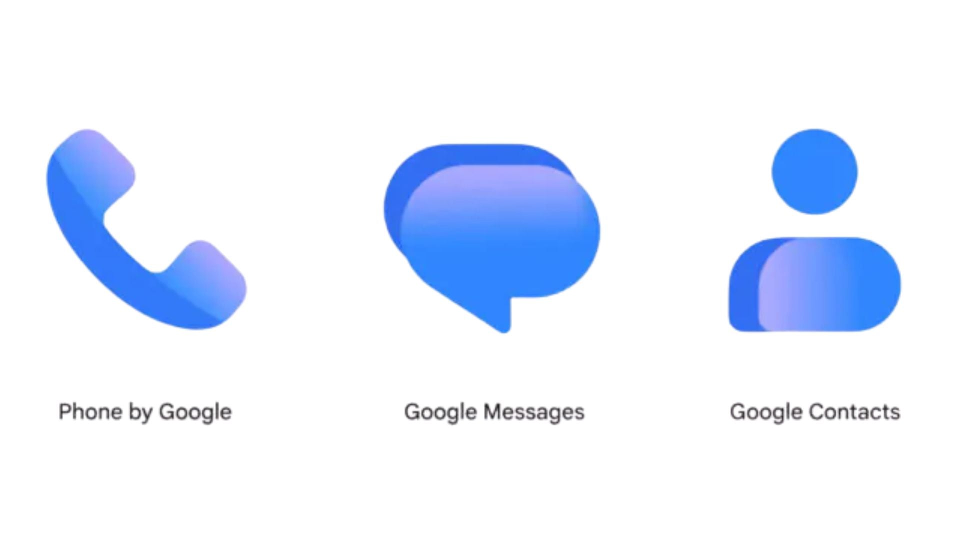
The team at Google is updating the icons for a few of its most used communication tools. The search giant is rolling out a fresh look for the Contacts, Messages, and Phone applications across Android devices. While the underlying functionality remains unchanged, the updated graphics introduce softer gradient coloring and adjusted shapes, moving away from the flatter minimalist style users have seen over the past few years.
The new designs bring brighter colors and rounder edges
The goal of this visual refresh is to make the app icons sharper and clearer on your home screen. As detailed in a recent blog post, the development team updated the curvature of the icons so they appear slightly more rounded. The new aesthetic replaces the solid flat backgrounds with vibrant gradients, giving the graphics a flashier and more dynamic feel.
This change is purely visual. The actual features, menus, and tools within these applications remain the same. The company wants to make sure its core communication suite looks cohesive alongside other modern software without forcing you to relearn how to send a text or make a call. The updated visual language helps the apps blend better with modern system themes while staying easy to recognize at a quick glance.
Don’t miss the best of The Mac Observer
Set us as a preferred source and our Apple reporting ranks higher in your Google Search results and Discover feed — one tap, no account changes.
Users can expect to see these changes appear on their devices over the coming weeks as the update moves through the Play Store. The new visual style for Messages was already spotted in recent beta versions, signaling that the full release is moving forward smoothly.
These updated graphics will also show up on the web versions of these services to keep the experience unified across different screens and platforms. If you rely on these tools daily, your home screen is about to get a slightly more colorful and modern look.

Discussion