
Apple made a big visual change in iOS 26: the new Liquid Glass design language. It’s everywhere, on the dock, app folders, widgets, and even the search bar. By default, everything looks translucent and layered, giving your iPhone a sleek, glassy vibe.
But not everyone loves it. Some find Liquid Glass distracting or harder to read, especially against busy wallpapers. The good news? You can tone it down with just a few settings. Here’s how.
Table of contents
Can You Fully Remove Liquid Glass?
Technically, Apple doesn’t let you switch off the new design system entirely, it’s baked into iOS 26. But you can minimize or neutralize the glass effect in two ways:
- Switching icon styles (Clear, Tinted, or Default) to avoid the full translucent look.
- Tweaking Accessibility settings like Reduce Transparency and Increase Contrast.
These steps won’t turn iOS 26 into the old iOS 18 design, but they make your Home Screen look closer to traditional solid colors.
Method 1: Change Icon Style
The quickest way to get rid of the glassy look is by swapping out the icon style.
- Long-press on the Home Screen until icons enter jiggle mode.
- Tap “Edit” in the top-left corner.
- Select “Customize.”
- Pick Default instead of Clear or Tinted.
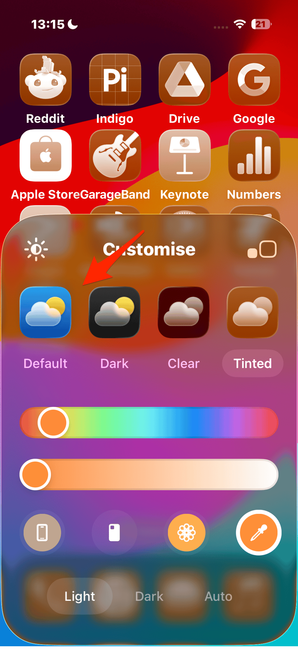
- Tap the checkmark in the top-right to apply.
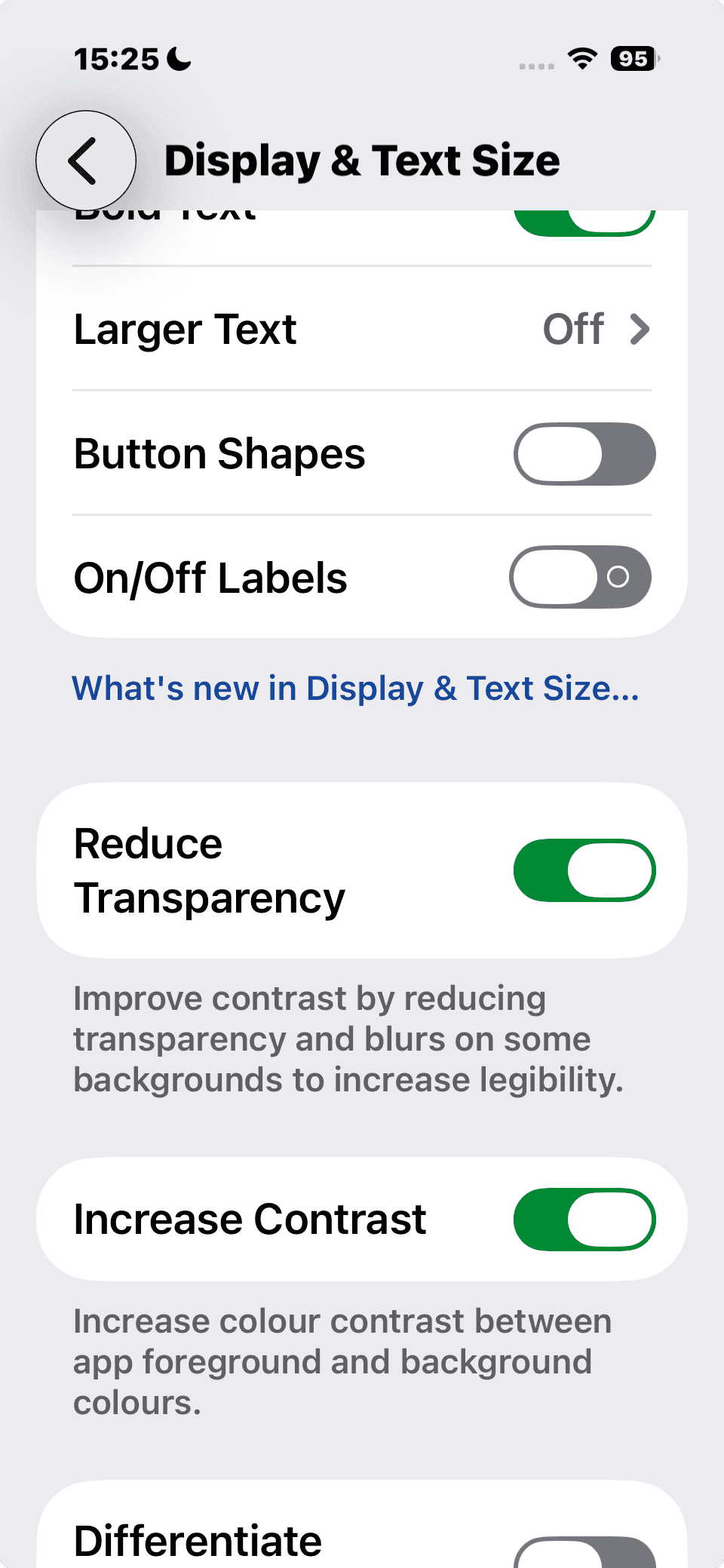
Method 2: Use Accessibility Settings
Apple built Accessibility tools that also affect how Liquid Glass looks:
- Open Settings > Accessibility > Display & Text Size.
- Toggle on Reduce Transparency.
- This replaces translucent elements with solid backgrounds.
- This replaces translucent elements with solid backgrounds.
- Optionally toggle Increase Contrast.
- This boosts separation between icons, text, and background.

With both settings enabled, Liquid Glass is almost completely gone. App icons and widgets look more solid, and text is easier to read on bright wallpapers.
Method 3: Pick the Right Wallpaper
Because Liquid Glass pulls tones from your wallpaper, you can “remove” the effect visually by switching to something simple. For example, dark gradients or muted solid colors make the translucency nearly invisible. Apple even released new official wallpapers for iPhone 17 that work well with or without Liquid Glass.
Troubleshooting
- Don’t see the Customize option? Make sure you’re on iOS 26. If the update isn’t appearing, here’s how to fix it.
- Icons still look “see-through”? Double-check Reduce Transparency is enabled.
- Want to undo changes? Just return to the Customize panel and switch back to Clear or Liquid.
Liquid Glass is one of Apple’s biggest design shifts in years, but you’re not stuck with it. Between icon customization, accessibility toggles, and wallpaper tricks, you can make iOS 26 look closer to the solid, traditional Home Screen many iPhone users prefer.
And if you want to go the other way, you can also experiment with Liquid Color tints or try Spatial Scenes wallpapers to lean into iOS 26’s new aesthetic.


It should be able to turn off. I don’t like it at all. Especially when I want to glance at the time.
Apple stopped giving a f&ck about accessibility years ago. They wrecked the Calendar app on the watch by making all the text blue-on-blue or red-on-red, not caring that this reduces readability for people with eyes older than 40. Just a bunch of fscking middle aged dudes who’ve had expensive eye surgery supervising 20somethings with no experience.
Liquid Useless is the new moniker. Did Apple test this for ADA compliance. Visually rough for any eye issues. Should be an option not to use Liquid Useless instead of force feeding to make the user vomit changes.
Thanks for the tips. I ended up using the Accessibility options and made it readable for myself. I’d love to remove the liquid glass option altogether but this will work.
I’m so surprised at the options Apple is making with these updates. I’m a BI Developer and the first thing I have to prepare for is accessibility for everyone – without making it harder for the people who need the accessibility.
After 20years of being an Apple user (iPod, iPhones, iPad, Apple TVs), I am seriously considering a move to Android.
Was dreaming of the soon to be released Mac Mini M5. Now have to reconsider.
Why do these companies have to change things for the sake of change! If something is good, leave it alone. And if they do make a non-necessary change, allow the user the choice if they want to use to new “wiz bang” thing!
Why is that so hard.
Couldn’t agree more. It should be offered as an option. Or not at all. As an autistic person with accessibility issues, I find the new Liquid Glass interface really visually disturbing.
Couldn’t agree more. It should be offered as an option. Or not at all. As an autistic person with accessibility issues, I find the new Liquid Glass interface really visually disturbing.
hard agree. i was barely awake when the update happened and i accidentally accepted the liquid аss setting. fortunately it didn’t happen on my phone, just the device i use to play games. i read ten tutorials on turning it off before finding this page. i’m auDHD and my experience is so similar. hang in there. it’s not a hatred of change, as neurodivergent folks are frequently accused of having, it’s an accessibility issue. i’m also old enough that it’s physically difficult to use.
I totally agree. Life is too complicated have to deal with all these changes I have not requested, do not like and find interfering with my use of the phone. APPLE should be thinking of pleasing the customers not the developers.
Liquid Glass is terrible, and the “fixes” don’t look good. Something like this should be the sort of thing you can turn off. No practical use.
All for some designer’s idea of what looks good. Serves no functional purpose. Especially annoyed at “change your wallpaper” to minimize the impact. Thanks for nothing
Might be late to the party on this but just had to update to IOS26. Good god it’s bad. And the Liquid Glass basically makes it impossible to do certain tasks on my phone. How on earth did this get past Beta testing? Why make half the screen, and the bit where you type, impossible to view? Was it a deliberate attempt of annoy customers? I can’t believe anybody would have asked for something that makes text harder to read or type!
I hate this update and I am going with android because of it. Apple isn’t hack proof. This Liquid Glass was a terrible. I cannot get my setting to where I can see the text. This is absolutely ridiculous!
Kimberly, if you’re on iOS 26.1, try going to Settings > Display & Brightness > Liquid Glass and changing it to Tinted. It did wonders for me.
Doesn’t help much – if at all!
I’m with you, my next phone may not be an iPhone because they really forgot about being user friendly.
Absolutely right, Kimberly! None of the above actually works for ‘menus’ (icon groups); these remain on a – for me – plain medium grey background, which is a very low contrast to most icons. It only works for icons themselves, in the tray and in the app library, which I don’t use anyway. No matter what settings are used, the time on the lock screen is still transparent. Absolutely ridiculous indeed.
Yes, transparent time on the lock screen is ridiculous! Maybe they’re trying to force us to wear the watch!
Sticking with 18 until I can turn Liquid Glass OFF.
Is a terrible update across the board everything takes twice as long to do it. I hate it so much. I am a 40 year Apple user and I’m done.
I tap my phone to see the time. Now one piece I can’t see it clearly because of liquid glass.As much money I have spent on Apple products and I don’t have the choice whether to keep it or turn it off. I’ve been with Apple ever since it came out. No more I’m done.
¡hola! Amalia.
my workaround (for my contacts) for this truly awful “improvement”, discovered whilst hacking at this “improvement”, was to tap the edit button. an uncessary extra step for a “feature” that user interviews after beta testing should have resolved. bah!
Thanks Amalia.
Couldn’t see a thing on the phone before your help.
Thank you