

Apple’s macOS 27 Golden Gate has sparked another debate over the company’s changing design direction, with some Mac users criticizing the redesigned app icons and increasingly iPhone-like interface. A recent Reddit discussion highlights growing frustration among users who prefer the more detailed appearance of older macOS versions.
The discussion began with a screenshot of the Mac Dock, showing Apple’s current collection of rounded-square app icons. Several commenters argued that the newer designs have lost the visual detail and distinctive appearance that once made macOS recognizable.
Mac Users Question Apple’s Design Direction
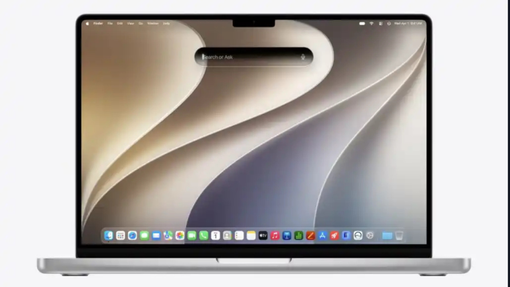
Much of the criticism centers on Apple’s efforts to create a consistent visual language across the Mac, iPhone, and iPad.
Don’t miss the best of The Mac Observer
Set us as a preferred source and our Apple reporting ranks higher in your Google Search results and Discover feed — one tap, no account changes.
Some users believe this approach has made macOS feel increasingly similar to iOS, particularly through simplified icons, rounded interface elements, and the Liquid Glass design.
Others defended Apple’s direction, suggesting that consistent interface elements could make it easier to develop apps across multiple platforms. The discussion also included users who preferred older releases such as macOS Mojave and Monterey.
Apple Continues Refining macOS 27
Apple has already introduced several interface adjustments in macOS 27, including more consistent window corners, redesigned window controls, and improvements to transparency and contrast.
The company also removed many unnecessary menu icons that appeared in macOS Tahoe, following criticism of cluttered application menus.

Meanwhile, recent macOS 27.2 beta changes have restored more precise visual feedback for volume and brightness adjustments.
Apple continues refining the Mac interface, although the latest discussion suggests that some longtime users remain unhappy with its overall appearance.




Discussion