iOS 26’s redesigned Dark Mode is receiving criticism from iPhone users who say the new look is uncomfortable, distracting, and in some cases even dizzying.
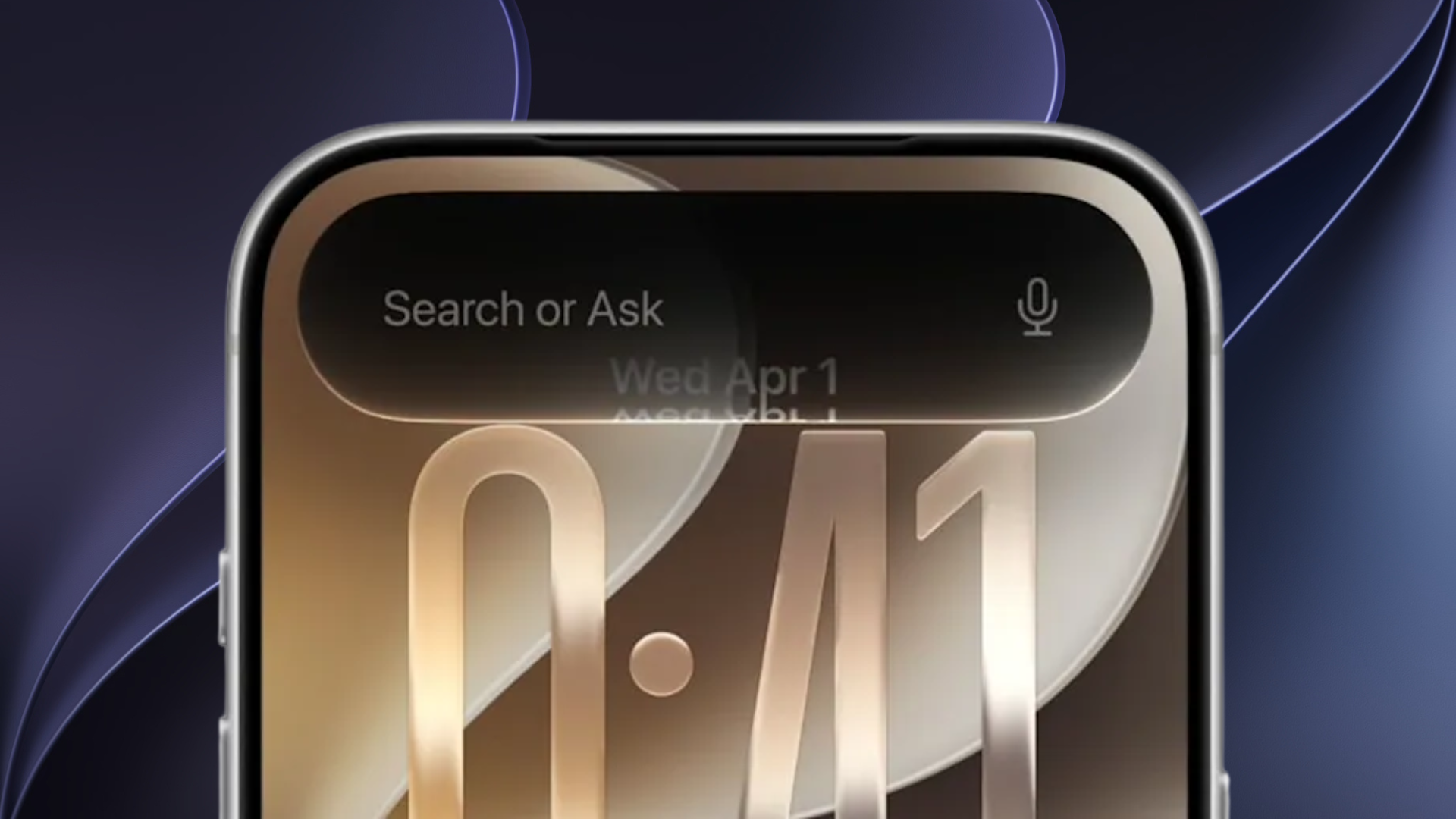
The update arrived on September 15, introducing a glowing outline effect around app icons when Dark Mode is enabled. While Apple appears to have intended this as a way to make icons stand out against the black background, many users say the result has the opposite effect. Instead of looking polished, icons appear to float unevenly on the screen, creating what some have described as a “tilted” or “off-balance” illusion.
Icons That Don’t Feel Anchored
For years, Apple has emphasized design consistency across the iPhone interface. App icons traditionally feel “anchored” to the Home Screen grid. With the glow effect in iOS 26, however, users say icons appear to hover awkwardly. Once noticed, the effect is difficult to ignore, making the Home Screen feel distracting rather than seamless.
Some users have even reported mild dizziness when viewing the redesigned layout for extended periods. Given how often iPhones are used throughout the day, this has become a significant point of frustration. Those struggling may find some relief by reducing animations in iOS 26.
From Refined to Flat
Critics also argue that the new look lacks Apple’s usual visual refinement. In light mode, icons retain a soft, three-dimensional feel. In contrast, Dark Mode in iOS 26 has been described as “flat” and “cheap,” with the glow outline resembling a quick design workaround.
Apple highlighted its “Liquid Glass” redesign as a core visual feature this year, but for many, the glow effect undermines that vision. Some have already turned to customizing app icons to offset the problem.
One user wrote:
“I updated my phone to iOS 26, and I’m really shocked when I saw the Home Screen in dark mode, to be honest! The frame glow effect makes apps look tilted, and it’s really distracting for me (I even feel a bit dizziness). Does anyone else have the same experience?”
Dark Mode was originally introduced to reduce eye strain and provide a sleeker alternative to bright displays. With iOS 26, however, some believe the changes undermine that goal, making the feature less comfortable than before. Users frustrated with the shift have even looked into downgrading from iOS 26.
Whether Apple will adjust the new Dark Mode design in a future update remains to be seen. The company has been quick to patch other iOS 26 bugs and issues since release, but design changes are less certain.